La pelotita de los postmortems
This game was implemented in 12 hours last Sunday, plus another couple of hours on Friday for sketching the concept. The main idea was to practice my iteration process for designing and implementing games, since last project was a little rough in that respect.
Requisites and first drafts
I started drafting the requisites for the project, which were the following, with no particular reasons:
- Game about gaining height with bouncing
- Game centred around a single mechanic
- Arcade
- Precision platformer with only obstacles, no enemies
- Structured in static rooms with contained challenges
- Dramatic curve revolving around tension and relief
- Doable in less than 12 hours
The first thing that I envision was a character that morphs into a ball in the air and bounces to get to new heights. It reminded me of Sonic's bubble shield powerup. Thinking of that motion, I remembered a very specific sensation; when you bounce a basketball by snaping it with the tip of your fingers. It is different of when you do it with the palm of your hand, that way the motion is softer. But when you use the tip of your fingers its more like some pow, more like a pop, its a sudden force that-... Explaining this is very hard. Tltr; it was a specific sensation. Some sudden opposing force applied like a dry blow. That gave me the idea of making the character a plain basket ball, and the insights of what would become the kinesthetic.
I analysed ways in winch a ball can be used to get through an obstacle; gaining height, calculate the bounce for passing through a tight spot, bounce out of somewhere before the floor breaks... It helped me shape the game I was heading in, and made me take the decisions (kinesthetic, structure, difficulty, rhythm, animations...) in what would be a first draft design that made before the start of the implementation.
Iteration process
I loosely defined a priority list for what elements must the game had and worked through them in iterations. I did it loosely because in each iterations I was must verify the results, reflect in the design decisions and see if they work, must be discarded or must be changed. If I planned all the iterations down the way that would have restricted my room for maneuver, or give me the sensation that I'm not doing a good job because I'm not following the plan. I planned more or less 2 iterations ahead. Here is how they looked:
- Basic player implementation
- Basic elements for building a level
- Refine player's kinesthetic
- Build the first 3 rooms
- Add advanced level elements
- Implement game's ending
- Build the rest of the levels
- Final touches
(To be honest, the last 3 were a little loose because I wanted to finish fast and have dinner lol)

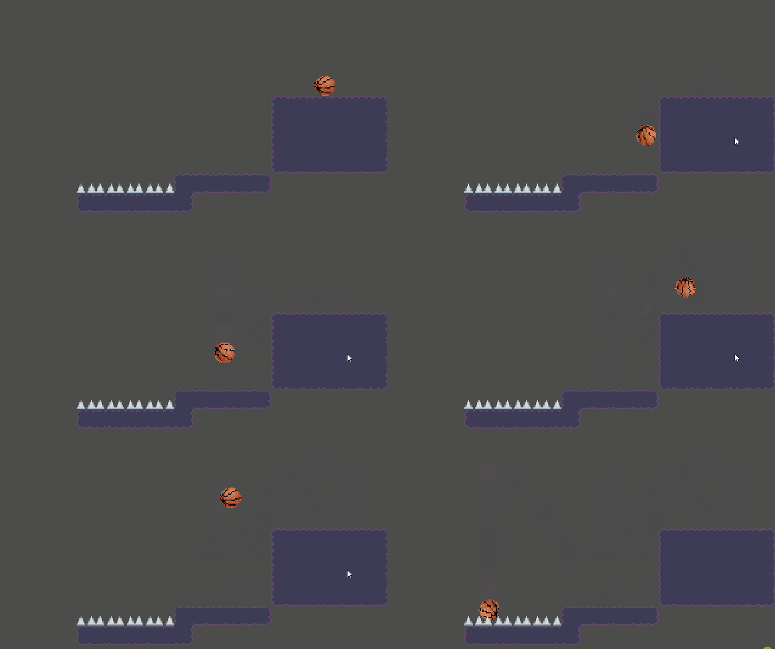
Game on iteration 2

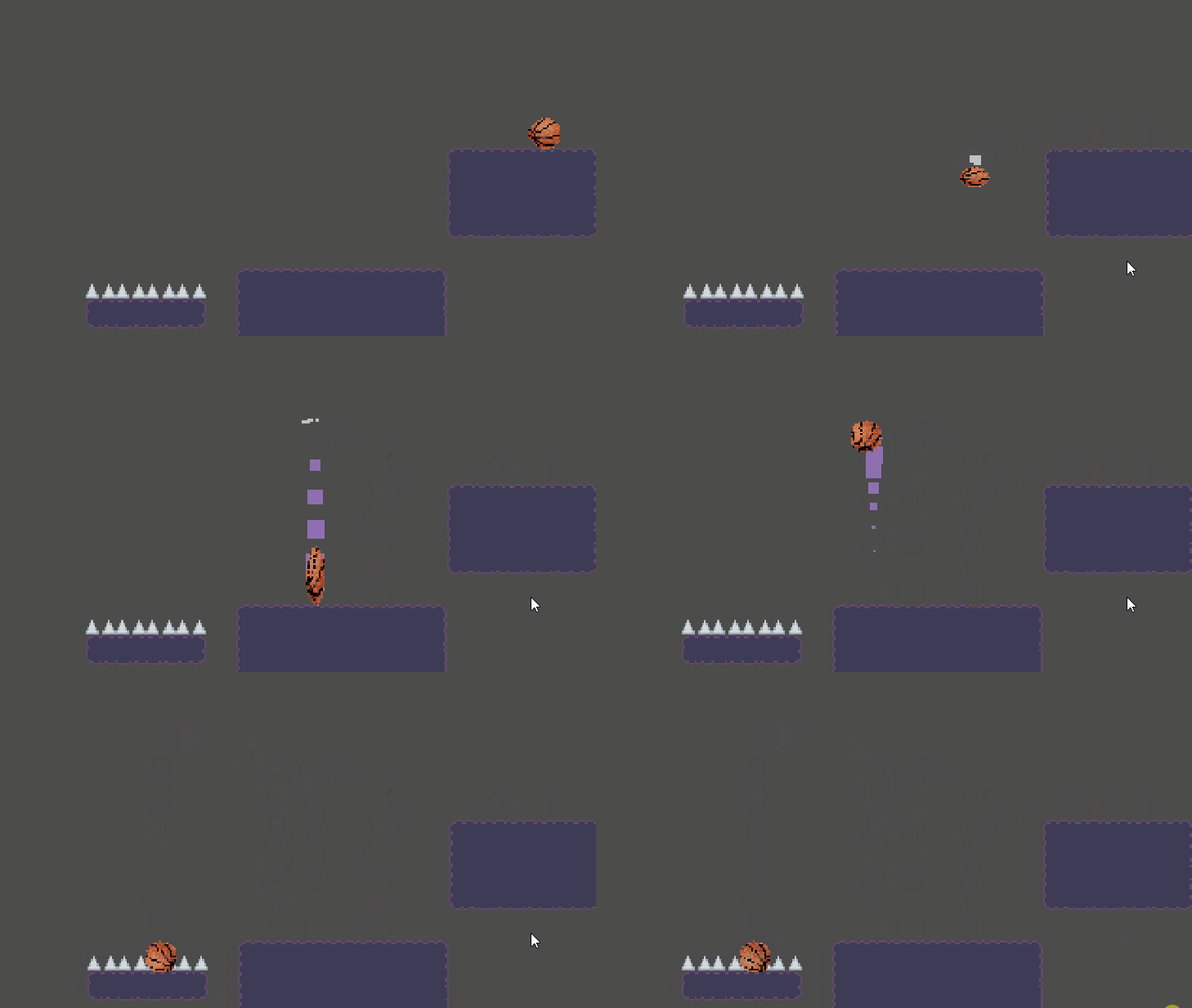
Game on iteration 3
The bad
The main problem I see with the game is the level design. The controls could permit a more wide and expressive movement, but the levels are claustrophobic, with narrow hallways and low ceilings, which limits the gameplay to a matter of bounce timing and tight actions. This is like this because of a bad decision took early on: the screen resolution and tileset size (320 x 180 and 16 x 16 respectively).
With this sizes for the game's assets, every element occupies a good chunk of the screen and makes difficult to design challenges for big enough rooms for that more wide movement. It also made hard the fine-tuning for the precision sections, because in many cases one spike was too high, but if I move it one square down, it was too low. I detected this in iteration 4-5, but decided to keep it like this and do what I can with what I have because of the time left. At the end, the level design is not bad at all, but the movement had more potential.
Also, the dramatic curve is not very worked in this project. I had some ideas for a better ending and wanted to implement some kind of joke-like rooms between some challenges to release some tension, but didn't work on it because of time. However, the room structure with checkpoints serves well enough for giving a little bit of structure to the game.
The good
I think the star of the show is the ball's gamefeel. I gave it a lot of though, trying to replicate the sensations I was talking earlier about. I think that what helped a lot for this was realising that I needed to add that subtle screenshake when the player pushes the button instead of when the ball smashes the ground, because what it communicates is the force of the invisible hand that changes the ball's course, and reinforces the player's direct input.
Conclusions
While I don't quite like everything about the result, I felt the process really clean in general. There was a couple things that maybe I could have verified earlier, like the resolution stuff, but the majority of flaws I see now, I knew during the development, and decided to let them go and focus on other things with more priority. In terms of time spent / results ratio, this is my best project to date.
Now I'm free, I don't have to do weekly projects anymore. My next game will be a really good game I hope. Change da world. My final message. Goodbye.

Files
La pelotita de los...
Bounce the basketball
| Status | Released |
| Author | pavro_o |
| Genre | Platformer |
| Tags | hard |
Leave a comment
Log in with itch.io to leave a comment.